How to Prepare a Print-Ready PDF (Bleed, Safe Zone & CMYK)
· Print2Elevate team
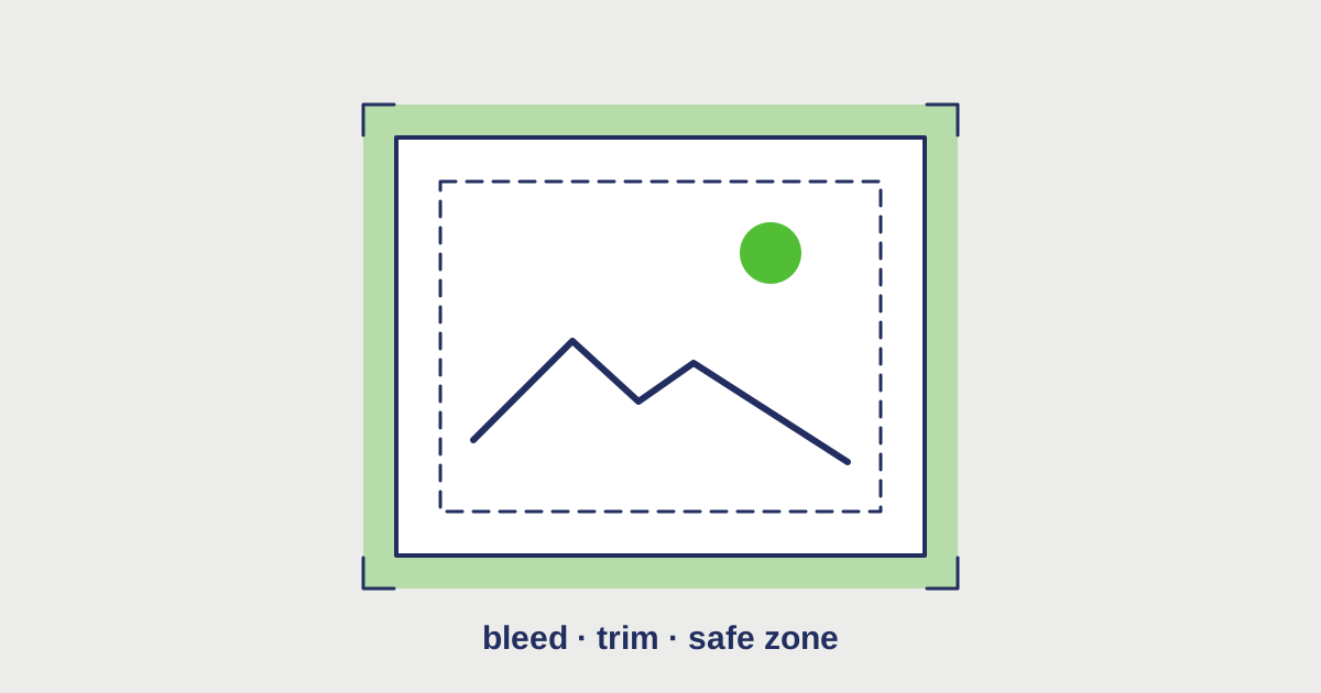
You’ve finished your design and it looks great on screen. Then the proof comes back with a thin white line along one edge, or a phone number that’s almost touching the trim, or colours that look muddier than you expected.
Nearly every one of those problems comes down to file setup. The good news: there are only a handful of settings that matter. Get these right and your file is “print-ready.”
1. Add bleed
Print shops don’t print on paper that’s already cut to size. They print on larger sheets, then trim them down. Cutting machines are precise, but not perfect — the blade can shift a tiny amount.
Bleed is extra artwork that extends past the final trim line, so if the cut is slightly off, you see more of your design instead of a white sliver.
- Standard bleed is 0.125″ (1/8 inch, about 3 mm) on every side.
- A 3.5 × 2″ business card with bleed becomes 3.75 × 2.25″.
- An 8.5 × 11″ flyer with bleed becomes 8.75 × 11.25″.
Any background colour, photo, or graphic that touches the edge of your design should stretch all the way into the bleed. If your design has a plain white background with nothing touching the edges, you still need to set up the document with bleed — it just stays white.
2. Keep important content inside the safe zone
The flip side of bleed is the safe zone (sometimes called the safety margin). Because the trim can shift slightly inward too, anything too close to the edge risks getting clipped.
We recommend keeping all text, logos, and important details at least 0.125″ inside the trim line — for larger pieces like flyers and posters, 0.25″ is even safer.
A quick way to think about it:
- Bleed = past the trim, for backgrounds
- Trim = where the paper is cut
- Safe zone = inside the trim, for anything that matters
Borders are a special case. A thin border right along the edge almost always looks uneven after trimming. If you want a border, make it thick and keep it well inside the safe zone.
3. Use CMYK colour, not RGB
Screens make colour with light: red, green, and blue (RGB). Printers make colour with ink: cyan, magenta, yellow, and black (CMYK). Some bright RGB colours — especially electric blues, neon greens, and vivid oranges — simply can’t be reproduced with ink.
If you send an RGB file, it gets converted to CMYK during printing, and you won’t control how. That’s where “why does it look dull?” comes from.
What we recommend:
- Set your document to CMYK before you start designing, or convert it before export
- Check your key brand colours after converting, and adjust if needed
- For large areas of black, ask us about “rich black” — a mix of inks that prints deeper than plain black
- Keep small black text as 100% K (black only) so it stays crisp
If your brand uses exact Pantone colours, mention it in your quote request. Some products can match Pantone; others will use the closest CMYK equivalent.
4. Use high-resolution images
Images that look sharp on screen are often only 72 dpi (dots per inch). Print needs much more detail.
- 300 dpi at actual print size is the standard for cards, flyers, and brochures
- Large-format items like banners can be lower (100–150 dpi) because they’re viewed from farther away
- Logos should be vector (AI, EPS, SVG, or vector PDF) whenever possible — they stay sharp at any size
Scaling a small image up doesn’t add detail; it just makes the pixels bigger. If your logo only exists as a small image from your website, our design team can rebuild it as a vector.
5. Embed or outline your fonts
If the print shop doesn’t have your exact font installed, a PDF without embedded fonts may substitute a different one — and suddenly your elegant script becomes a default typeface.
When exporting your PDF:
- Choose a PDF/X preset (PDF/X-1a or PDF/X-4 are common) — these embed fonts automatically
- Or convert text to outlines before exporting, which turns letters into shapes
Keep an editable copy of your file before outlining, because outlined text can’t be edited.
A print-ready checklist
Before you send your file, run through this:
- Document is the final trim size, plus 0.125″ bleed on every side
- Backgrounds and edge graphics extend into the bleed
- Text and logos sit inside the safe zone
- Colour mode is CMYK
- Images are 300 dpi at print size; logos are vector
- Fonts are embedded or outlined
- Exported as a PDF, one page per side, with crop marks if your software offers them
Not sure your file is ready?
Don’t worry — this is part of what we do. When you request a quote, tell us how your design is set up. If you have a file, we’ll review it for bleed, resolution, and colour issues before anything goes to print. If you don’t, our design team can prepare it for you.
Get a quote and choose “I have a design but it may need prep” — we’ll take it from there. Or browse business cards and flyers & brochures to see the specs for each product.